Wednesday, 19 October 2016

The Olde Farmhouse Postcard Reveal for the November 12 & 13, 2016 Market


Sooo excited to reveal this beauty and to once again be involved with this fantastic market!!! This postcard couldn't be any cuter! Leah, founder of The Olde Farmhouse and junker extraordinaire, always has such great creative ideas with each market she organizes and I love how together we can collaborate and bring her vision to life. 

So set aside November 12 & 13 for the Tradex @fvtradex in #abbotsford. See ya there for some great junking! Dee 


😊 #marketing #graphicdesign #vintagemarket #letsgojunking#theoldefarmhouse #vintage #handmade #yvr #shoplocal

Tuesday, 4 October 2016

Business card refresh done for The Vintage Verandah and I am super pleased with the results!

I absolutely LOVE how this biz card turned out! The Vintage Verandah @vintageverandah brand and store has been gradually evolving and so too must the business card that represents this wonderful business run by Tanya and Caroline! Check it out if you're in Cochrane, Alberta - thevintageverandah.com

To ensure a print-worthy business card, I made sure that I had high resolution images for each of the paint companies that The Vintage Verandah sells, to ensure they print crisp and clean. No fuzziness allowed! High resolution images for your print marketing is a design MUST! Plus, companies want their brand to look their best and are usually more than willing to forward their high-res logo versions. Don't just grab logos off the web...they are on the web for a reason — they are low-res, small files that upload quickly and are specifically developed for web and social media online purposes.

In addition to these high res paint co. logos, I've added a few graphic elements to tie-into the logo and to reflect The Vintage Verandah vintage, prairie chic style. All and all, I'm super pleased with the results and so are Tanya and Caroline.

Dee :)


Monday, 18 July 2016

Dental Passport Design for Dr. Nancy Vertel - A Refreshing Take on Keeping Track of your Child's Dental Visits

We have passports for our child's health records in British Columbia but what about our children's dental health? Other than their next appointment, parents don't generally have a place to store all their child's dental visits and any recommendations/notes the dentist relays.

Enter the Dental Passport!!!

Collaborating with Dr. Nancy Vertel, a pediatric dentist, I came up with 2 different Dental Passports, one for her Maple Ridge location and one for her South Surrey location. The Half Moon Dentistry for Children and The Maple Ridge Dentistry for Kids Dental Passports were designed as 4 inch square full-colour, full-bleed booklets that reflect each location's unique brand and identity. They turned out soooo darn cute!!!

All and all, parents are very pleased that they finally have a place to keep track of their child's dental needs. Plus, they get some handy dandy dental tips too and their kids can collect stamps to earn prizes!

All and all, the project turned out just as I had hoped.

Dee :)


Wednesday, 1 June 2016

Red Door Farm- Logo + Brand REVEAL


red door farm welcome sign at farm
red door farm - original welcome sign (inspiration)


I am so pleased to reveal what I've been working on lately :) :) The Red Door Farm logo and brand! Working with Cheryl of Red Door Farm has been a real treat! She has a wonderful small family-run farm located in South Langely, BC, that offers Christmas Trees in the Winter Season and vintage home and garden treasures year-round. 

Working with the look and feel Cheryl had already established, and using the statement "red door" sign that greets customers as they enter the farm as inspiration, I was able to "tweak" the look and introduce a beautiful colour palette, visual  elements/patterns, a font package and two logo versions. Then, came the above business card, that can be used to hand out to customers or used as pricing hang tags.

Both of us are really happy with the results. 

To contact Cheryl, please check out Red Door Farm on Facebook at:

OR

Instagram:

OR

Blog:

Dee :)

Refreshing Room by Room - The Power of Colour

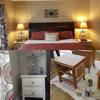
Now that I've had a bit of a breather from some of my graphic design work I've been able to throw my attention to some of the rooms in my home. I don't feel my home needs a lot of TLC, but rather a bit of a refresh. Lighter, brighter colours are in and my need to "refresh" my home has been nagging at me. BUT it had to happen in stages - due to time, money and energy! LOL! Especially the last one. Kids are tiring!!!

I've come up with a colour palette that is current, but at the same time timeless and it has really rejuvenated my whole home. I LOVE how colour changes the mood, feeling and overall look of a room and a home! Paint is so powerful!

I started with my kitchen and went from Benjamin Moore Providence Olive to Bleeker Beige. This then leads into the bulk of my home, since it's open concept, which has gone from Sisal to Manchester Tan. Even though I'm South facing, the shift from Sisal to Manchester Tan has completely brightened and lightened and refreshed the spaces. The furniture didn't really change but the "look" is now current. A few tweaks of the accessories has really brought the spaces into 2016.

To add a pop of colour, I decided to go with BM Seahaze in the front flex room/den. What a gorgeous colour! It's grey, but has a greenish blue undertone that looks amazing with browns, creams, whites, reds, blues. Really the colour acts as a neutral since it is so versatile!

Then for the Master Suite, I went with Bennington Gray and Grant Beige. Voila! Instant refresh!

All and all I'm very pleased with all of my colour choices. They are timeless and take their cue from nature. The colours are not too overpowering and are very soothing and versatile. I feel like I can change out my accessories at any time and won't feel the need to change the wall colour! Yipee!

So, next time you want to change your room, consider changing out the wall colour; it's an inexpensive way to give your place a facelift!

Dee :)


Friday, 27 May 2016

The Prairie Girls Vintage Market Postcard - REVEAL


The Prairie Girls Vintage Market postcard is done and I couldn't be more proud. I absolutely LOVE the Fall colours, the vintage floral mix combined with the chalkboard background and the new Prairie Girl logo + fonts. It really all came together in this wonderful market card!

So, if you're not doing anything September 10, 2016, I suggest you head down to the Cochrane Agricultural Society Barn located at the NorthWest corner of the junction of Hwy 1A and Hwy 22 in Cochrane, Alberta.

For more information about this event check out The Prairie Girls website or FB page:

http://www.theprairiegirlsmarket.com/
https://www.facebook.com/theprairiegirls

Dee :)

Monday, 9 May 2016

The Prairie Girls Vintage Market - Logo + Branding REVEAL

I have been super duper busy lately, with a variety of client projects on the go, one of which is The Prairie Girls Vintage Market logo and brand. (Instagram: @theprairiegirlsmarket)

Working with sisters, Leah of The Olde Farmhouse (Instagram: @theoldefarmhouse) and Tanya of The Vintage Verandah (Instagram: @thevintageverandah), I was able to help capture their vision and personality with this logo and am working with them to develop their wonderful brand. I've worked with both of them individually with their own logos and brands and it's been wonderful to help them develop this joint venture embracing their love of all things prairie and vintage.


I am currently working with them to design their market postcard for September. So, stay tuned for their market date announcement very soon! 


Dee 


mile emoticon

 ‪#‎vintagemarket‬ ‪#‎graphicdesign‬ ‪#‎marketing‬ ‪#‎cochranealberta‬ ‪#‎logo‬

Thursday, 10 March 2016

Elementary School PAC FUNDRAISER - Supporting Kanaka Creek Elementary

Supporting our kids' schools so that students, teachers and support staff can have the all the necessary tools and equipment to create a fun and positive learning environment is so so important! So when I can help out with any type of PAC fundraiser at my daughter's school I'm all over it! Bring it on!

This year Kanaka Creek Elementary held a Granville Island Theatre Sports Oscar Buzz Gala. It was SO much FUN and I had tears streaming down my face from laughing so hard! Plus, the school raised a whack of moola to support a variety of school/PAC fundraising initiatives. Win-win situation wouldn't you say?

Can't wait to see what's next for a fundraiser! 2 Casino Nights and now a Theatre Sports Gala. So much fun and lots of $$ raised! Good times = Good Fundraiser!

Dee :)

Wednesday, 9 March 2016

REFERRALS Referrals REFERRALS - The Importance of Referrals for your Business


Word of mouth about your business and referrals from friends, family, and business acquaintances is SO SO SO IMPORTANT! With the constant inundation of direct emails, phone calls and direct mail pieces we receive on a daily basis, it can be quite overwhelming!

So, in a world such as this, where we can Google anything and see how many "stars" that business has received from customer ratings, the importance of a GOOD REFERRAL is as good as gold! Word of mouth and connecting with people who will appreciate your business, and seek what you offer, is invaluable.

A part of a good referral system is reaching out to FELLOW PROFESSIONALS in your area of expertise. How can you support one and other? How do you complement each other's strengths? Knowing this, and what you can bring to the table, allows for very positive working relationships to develop and a great referral system to be implemented. The Huffington Post's article, "Why Every Business Needs a Referral System," gives some insight into this topic and is worth a quick once over for every business, big or small —, http://www.huffingtonpost.com/marc-wayshak/why-every-business-needs-_b_3767485.html.

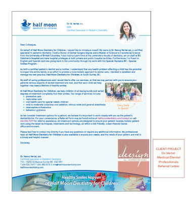
Recently, I helped my client, Dr. Nancy of Half Moon Dentistry for Children, with the task of developing a letter to reach out to fellow professional colleagues. Taking the time to sign and mail out a letter is much more personal than an email. It shows that you've spent some time and effort in reaching out. Of course, follow-up after mailing the letter is also key in this process! But, reaching out to other professionals can be a win-win situation — the client's needs are taken care of and all parties involved get the job done.

So, if you haven't already done so, revisit your strategy when it comes to referrals and how you deal with them. It might just be the boost you and your business needs!

Dee :)


Wednesday, 24 February 2016

Recall Postcard REVEAL: Dr. Vertel

Who doesn't need a little reminder every now and then?? I don't know about you, but I'm super forgetful if I don't write it down or put a reminder into my phone calendar! LOL! So, that being said, tying into the Half Moon Dentistry for Children brand, I just finished putting together a design for some Recall cards to mail out to clients as a friendly reminder of upcoming appointments. I was asked to create a fun, colourful card that will be sent out to all the wonderful kids that Dr. Vertel sees at the Half Moon Dentistry for Children office in Surrey, BC. Super cute and super helpful! 

Dr. Vertel's office has a gorgeous ocean theme with amazing sea animals and creatures that we just had to highlight and show off, just like we did with her birthday postcard design! So, using an image from her new office mural, I was able to design a fintastic 4x6 inch postcard that will be sent out to all Dr. Vertel's families client list to remind them of their future visit dates/times.

The Deesign Project: develop a Recall Card for mailing purposes to send out to all Half Moon Dentistry clients.